Lay out your application in order to match the environment. Navigation being mainly through headers, ensure they remain consistent and usable, throughout all our interfaces.
Overview
The header is made of several layers.
In this example, the header contains all possible layers.

Behavior
The header behavior must be consistent and seamless, even when not all layers are used.
Global Nav (Mandatory)

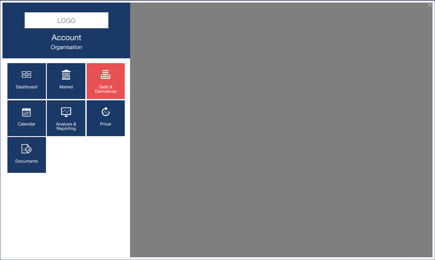
Clicking the button on the top-left corner of the global header opens a panel coming from the left side of the page. This panel includes the other modules available to the user.
Users can hover the 3 buttons on the right, and click them to open the relevant page.
Only the logout button behaves differently: a popup displays, asking the user to confirm they want to log out of the application. This avoids users logging out by mistake.
Local Nav (Optional)

The Local Nav first indicates what application the user is using.
Beside it, the user can see a link to the sections of the applications that they can access.
When the user is on a page, the corresponding link displays a background with the color corresponding to the second color of the user’s theme. The other ones, when hovered, display a bottom line of the same color.
Page Header (Mandatory)

The title and the icon on the left can be used to reload the page.
The button on the right triggers the action corresponding to its name.
Page Tabs (Optional)

When the user clicks a tab, it slides the page to the corresponding section. The tabs can also be hovered when not enabled.
Global Navigation
This menu provides the global navigation for all Hive applications.

See Finance Active's Design System for more details.