Lay out your application in order to match the environment. Lists are handy for displaying a large number of complex items.
Thumbnail
To display complex items and keep them understandable, we have developed thumbnail cards. Thumbnail cards contain basic information describing the items. Clicking on a thumbnail card opens a detailed view of the item.

Actions
Filters include a number of criteria, given with a default value, defining the context of the page.
Action Button
You can find action buttons directly inside the thumbnail card. We recommend having the action at the end of the thumbnail card.

Selection
Users select one or several items of the list. We recommend having the checkbox (or the radio button) on the left in the card thumbnail.

Groups
When items are gathered into groups, have a thumbnail card as a header of the group to indicate what the items are about, and what they have in common.
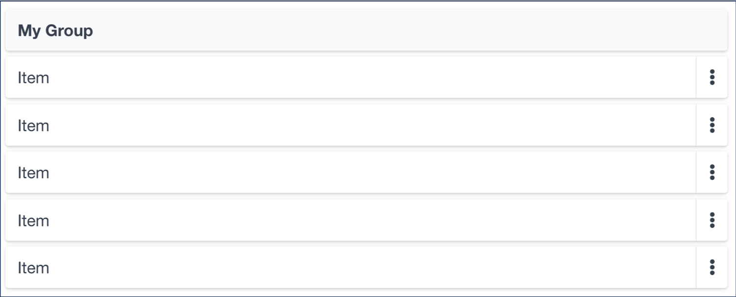
Note: You can have actions inside the group header, if required.
See Finance Active's Design System for more details.